
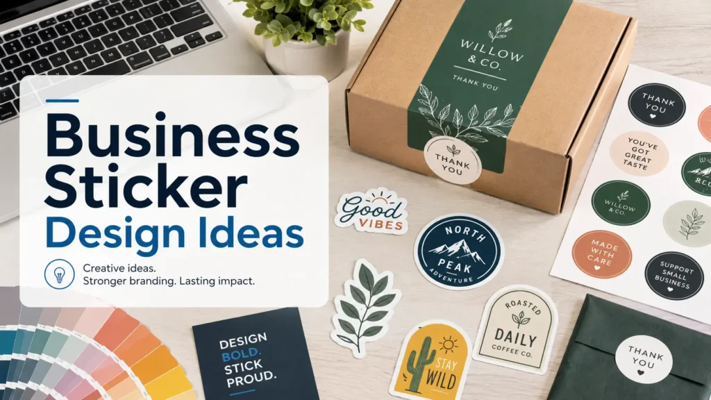
TLDR
Business sticker design works best when the sticker has one clear job: identify, seal, thank, promote, label or guide.
Use simple layouts, strong contrast, readable type and enough breathing room around your logo or message.
Choose die-cut stickers for giveaways, business card stickers for networking and roll labels for product packaging.
Before ordering, check size, material, finish, QR code readability and file resolution.
A good sticker is small, but it has to do a surprising amount of work. It may sit on a shipping box, a coffee bag, a laptop, a water bottle, a candle jar or the back of a business card. That is why business sticker design should start with a practical question: what do you want this sticker to do?
The strongest designs are usually not the loudest. They are the ones a customer understands in half a second. A clean logo sticker can make a plain mailer feel branded. A simple thank-you seal can make a small order feel more personal. A QR code sticker can turn a product, sign or package into an easy next step. The trick is choosing the right format before you start decorating.
Why Business Stickers Work Best When They Have One Job
Stickers are useful because they are flexible. That is also the reason many business sticker projects get messy. A single 2-inch sticker cannot be your logo, slogan, phone number, website, QR code, Instagram handle, product warning, thank-you note and brand manifesto.
Pick one job first.
For product packaging, the sticker might identify the scent, flavor, size, batch or brand. For ecommerce orders, it might seal tissue paper or thank the customer. For events, it might act like a mini business card. For local service businesses, it might turn a hard hat, water bottle, toolbox, laptop or car window into soft promotion.
Once the job is clear, the design gets easier. You know what text matters, how large the sticker should be, what shape fits and whether durability matters.
Business Sticker Design Starts With The Use Case
A sticker for a candle jar has a different job than a sticker handed out at a trade show, so business sticker design needs to follow the setting. A packaging sticker needs to look clean on a product. A giveaway sticker needs to be something people actually want to use. A business card sticker needs to carry contact details without looking cramped.
Logo Stickers
Logo stickers are the easiest place to start. They work well for customer freebies, event tables, product inserts, laptops, water bottles, gear cases, toolboxes, delivery vehicles and employee swag.
For most brands, the best logo sticker is not a tiny version of the full brand system. It is a simplified mark, wordmark, mascot, icon or short tagline. If the logo has thin lines or small secondary text, make a sticker-specific version with fewer details.
Die-cut logo stickers are especially strong when your logo has a recognizable outline. A coffee shop cup icon, skull mascot, mountain badge, bakery mark or pet brand character can look better when the cut follows the artwork instead of sitting inside a plain square.
Packaging Seals
Packaging stickers do not need to shout. A small circular seal on tissue paper can make a box feel finished. A rectangle sticker across a paper bag can hold the fold closed. A clear label can keep the product visible while adding branding.
This is where the sticker design should support the product instead of competing with it. If the product already has a busy label, use a quiet seal. If the package is plain kraft, white, black or clear, the sticker can carry more personality.
Common packaging sticker ideas include:
- logo seals
- “thank you” stickers
- product name labels
- seasonal inserts
- reorder QR codes
- social follow prompts
- batch or flavor markers
Thank-You Stickers
Thank-you stickers are popular because they add warmth without adding much work to fulfillment. But they can feel generic if they say the same thing every other small business says.
Try to make the wording sound like your brand. A clean skincare brand might use “Packed with care.” A playful snack brand might use “You have excellent taste.” A handmade goods shop might use “Made, packed and sent with care.”
A thank-you sticker does not need a lot of decoration. The message should be easy to read, the logo should be present but not huge, and the color should match the rest of your packaging.
Business Card Stickers
Business card stickers are useful when you want the contact info of a card but the staying power of a sticker. A photographer, food truck, tattoo artist, band, gym, lawn care company or local repair service can use them at events, counters, markets and customer handoffs.
The best format is usually simple: logo, name, short service description, website or QR code and one contact method. Do not make people choose between five ways to reach you. Pick the path you actually want them to use.
QR Code Stickers
QR code stickers can be great, but only if they scan easily. Keep the code high contrast. Leave clean white space around it. Do not bury it in a texture, gradient or busy illustration. Also, test it at actual size before ordering a larger run.
A QR sticker can point to a menu, review page, reorder page, loyalty program, installation guide, booking page, portfolio or social profile. The call to action should tell people what they get: “Scan to reorder,” “Scan for care instructions” or “Scan to book.”
Choose Shapes, Sizes And Finishes That Match The Message
Shape changes how a sticker feels, and it is one of the easiest business sticker design choices to overlook.
Circles are great for logos, thank-you seals, bakery packaging, candles, coffee bags, jars and simple badges. Rectangles are better for ingredients, warnings, contact details, QR codes and text-heavy designs. Ovals feel softer and work well for food, floral, boutique and handmade brands. Die-cut stickers are best when the shape is part of the personality.
Size matters too. A 1.5-inch sticker works for a seal, but it is not ideal for a lot of text. A 2-inch sticker can handle a logo and a short phrase. A 3-inch sticker is more comfortable for giveaways because the art has room to breathe. Larger stickers work for windows, vehicles, equipment, retail displays and event signage.
Finish should support the brand. Gloss can make colors look brighter and more energetic. Matte reduces glare and often feels cleaner for packaging, QR codes, product labels and minimalist branding. Clear stickers work when you want the surface underneath to show through, but they need strong contrast.
Keep The Layout Clean Enough To Read
The most common mistake is trying to shrink a flyer into a sticker.
Use a simple hierarchy:
- primary element: logo, product name or main message
- secondary element: short tagline, flavor, scent or service
- action element: website, QR code, handle or contact info
If all three elements fight for attention, the sticker will look noisy. Make one thing clearly dominant. Then support it with one or two smaller details.
For text, avoid ultra-thin fonts, tiny script fonts, low contrast color combinations and long sentences. Read the sticker from arm’s length. If you have to squint, simplify.
A good quick test is to view the design at actual print size on your screen or print it on paper. A layout that looks clean at 6 inches wide in Canva may feel cramped at 2 inches wide in real life.
Use Color And Typography With Restraint
Brand consistency matters, but a sticker does not need to use every brand color. Two or three colors are often enough.
If your brand palette is soft, add contrast through dark text or a bolder outline. If your brand palette is loud, give the design enough white space so it does not feel chaotic. For packaging, think about the color of the box, bag, jar, bottle or mailer. The sticker is not floating in space. It will sit on a real surface.
Typography should match the brand but stay readable. A serif font can feel refined. A rounded sans serif can feel friendly. A bold condensed font can feel direct and energetic. Script fonts can work for short words, but they become hard to read fast. Use them carefully.
Print-Ready File Setup Tips
Clean files prevent most sticker problems.
Use the highest-resolution artwork you have. Vector files are ideal for logos and simple shapes because they scale cleanly. High-resolution PNG, JPG, PDF, AI, EPS and SVG files can also work depending on the design and printer.
For raster artwork, aim for about 300 PPI at the final printed size. That means a 3-inch sticker should be built with enough pixels to print cleanly at 3 inches, not just look good on a phone screen.
Leave a safe margin around important text and logos. If you want a border, make it thick enough to survive normal cutting variation. Very thin borders can look uneven even when the sticker is cut well. If you want full bleed, extend the background past the cut edge so there is no accidental white rim.
QR codes need extra care. Use a sharp file, strong contrast, a clear quiet zone and a size that matches the scan distance. Then test the code before final print approval.
What To Order From CustomStickers.com
CustomStickers.com is a good fit when you already have artwork and want a professional proof before printing. For general brand giveaways, start with custom business stickers. For networking, event handouts or creator promotions, business card stickers are a smart format. For product packaging, custom labels or roll labels usually make more sense because they are easier to apply in quantity.
This is the practical split:
- Order die-cut stickers when people will keep, display or share them.
- Order business card stickers when the sticker also needs to carry contact info.
- Order roll labels when you are labeling products, bags, bottles, jars, boxes or mailers in batches.
- Order clear stickers when the surface underneath is part of the design.
- Order matte when glare or readability matters.
- Order gloss when color pop matters more than glare control.
A professional proof is worth checking closely. Look at the cutline, spelling, border width, QR code size and whether the final shape supports the design. That final review is not the exciting part, but it prevents the most annoying mistakes.
Sticker Design Checklist Before You Order
Before you send your file to print, ask these questions:
- Can someone understand the sticker in one second?
- Is the logo or message readable at actual size?
- Does the shape match the design?
- Is the sticker meant for packaging, giveaways, outdoor use or product labeling?
- Is there enough safe space around text, borders and QR codes?
- Does the finish match the use case?
- Did you test any QR code at actual size?
- Did you check spelling, website URLs, handles and phone numbers?
If the sticker passes those checks, it is probably ready.
